
Effectively visualizing complex datasets has become crucial across industries in the era of data-driven decision-making. Creating, analyzing, and sharing insights through graphs and charts is now simpler than ever thanks to AI tools for graphs.
This article presents three robust platforms that use artificial intelligence to streamline and improve the data visualization process: Julius, Graph Interpreter by YesChat, and Piktochart AI.
To avoid AI detection, use Undetectable AI. It can do it in a single click.
Table of Contents
Julius AI: Your AI-Powered Graph Maker and Data Analyst
Key Features of Julius AI
- Using Julius AI-powered graph maker, which automatically recommends the best chart types for your data, you can turn your raw data into beautiful visualizations.
- Julius is a potent artificial intelligence data analyst who assists you with data analysis and visualization. Create graphs, forecasting models, chat with your data, and more.
- Make a bar graph that is grouped. Bar charts that are clustered or grouped are used to compare counts, frequencies, or other metrics among several groups and categories.
- Julius is an AI assistant made for computations, data science, and statistical analysis. Several large language models (LLMs) are used by Julius.
- Use AI to advance your research. Julius allows you to conduct statistical analysis and summarize scientific literature in one location.
- Use the top AI data analytics platform to respond to inquiries about data. Get insights in a matter of seconds, perform predictive forecasting, and produce visualizations.
- Use the first AI-powered statistics solver to compute statistics for free. Get comprehensive assistance with statistics homework, compute sample sizes, and compute p-values.
- SOC2 Type 2 certified
Example Graph Types Created by Julius
- A line graph that contrasts the hours spent on bricklaying and scaffolding.
- A bar graph that examines trends in healthcare data.
- A bar graph that displays the breakdown of surgeries.
Read Also >>> Comprehensive Guide to AI Governance Tools in 2025
Industries and Applications
- Finance
- Marketing
- Business
- Data science
- Education
- Scientific research
Graph Interpreter by YesChat: AI Analysis of Visual Data
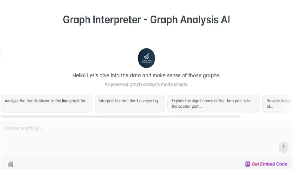
The purpose of Graph Interpreter is to examine and describe different kinds of charts, graphs, and data visualizations. Its main goal is to make complex information understandable to both professional and lay audiences by offering precise and understandable interpretations of graphical data.
Key Features of Graph Interpreter
In-depth Evaluation
For instance, Graph Interpreter can analyze growth rates, compare continents, and identify socioeconomic factors influencing trends in a bar graph showing population growth across continents.
Scenario: Helpful in scholarly research presentations where in-depth, fact-based conversations are required.
Synopsis of the Findings
As an illustration, a scatter plot that compares the frequency of exercise to general health indices in adults can be used to highlight important patterns and anomalies and provide a brief overview of the degree of the relationship between exercise and health.
Situation: Performs admirably at seminars on health and wellness.
Contextual Interpretation
For instance, when examining financial charts, like those showing changes in stock prices, Graph Interpreter can place the graph in relation to recent market sentiments or economic events.
Scenario: Financial analysts find it useful in strategic meetings or client briefings.
Target Users of Graph Interpreter
- Educators and Students
- Data Analysts and Scientists
- Business Professionals
How to Use Graph Interpreter?
Get a Free Trial: To get a free trial of Graph Interpreter, go to yeschat.ai.
Select Graph Type: Determine the kind of graph that requires analysis.
Upload Graph: Verify that the image is readable and clear.
Indicate Analysis Type: Select between a succinct synopsis and a thorough justification.
Get Insights: Use the insights to improve presentations or comprehension.
FAQs about Graph Interpreter
Types of Graphs Supported: Line, bar, pie, scatter plots, histograms.
Can it Handle Complex Graphs?
Yes, including multi-variable analysis.
Accuracy: Uses advanced algorithms and cross-verifies data points.
Preparation Needed: High-resolution, clearly labeled graphs.
Use Cases: Presentations, papers, business decisions, or data comprehension.
Piktochart AI: Free AI Graph Generator for Instant Visuals
Easily convert data into understandable visuals with Piktochart AI-powered graph generator, which is intended for powerful data communication. No design knowledge is required.
Key Features
- Professional graph ideas in a matter of seconds.
- Whether you’re using pie charts, line graphs, or bar graphs, Piktochart AI makes sure your data conveys clearly.
- Ideal for publications or presentations.
How it Works?
Describe Your Graph: In no more than 120 characters, state the goal of the graph.
Pick from Templates: Pick from templates tailored to your industry.
Personalize Your Graph: Modify the colors, fonts, layout, and add icons or images.
Publicize and Advertise: Export for sharing in PNG or PDF formats.
Graph Types Supported
Bar graphs: Perfect for comparing categories.
Line graphs: Excellent for visualizing trends.
Pie charts and donut charts: Used to display the proportions of a whole.
Histograms: Show the distribution of numerical data.
Bubble charts and scatter plots: Display variable relationships and correlations.
Area Charts: Show totals accumulated over time.
Conclusion: AI Tools for Graphs
By making graph creation and interpretation quick, easy, and incredibly accurate, artificial intelligence has completely changed the field of data visualization.
These tools showcase the future of intelligent data communication, whether you’re looking to create stunning graphs with Julius, decipher intricate visual data with Graph Interpreter, or quickly create expert charts with Piktochart. Take advantage of AI’s power to revolutionize how you interpret and display data.
